pingouin.qqplot#
- pingouin.qqplot(x, dist='norm', sparams=(), confidence=0.95, square=True, ax=None, **kwargs)[source]#
Quantile-Quantile plot.
- Parameters:
- xarray_like
Sample data.
- diststr or stats.distributions instance, optional
Distribution or distribution function name. The default is ‘norm’ for a normal probability plot.
- sparamstuple, optional
Distribution-specific shape parameters (shape parameters, location, and scale). See
scipy.stats.probplot()for more details.- confidencefloat
Confidence level (.95 = 95%) for point-wise confidence envelope. Can be disabled by passing False.
- square: bool
If True (default), ensure equal aspect ratio between X and Y axes.
- axmatplotlib axes
Axis on which to draw the plot
- **kwargsoptional
Optional argument(s) passed to
matplotlib.pyplot.scatter().
- Returns:
- axMatplotlib Axes instance
Returns the Axes object with the plot for further tweaking.
- Raises:
- ValueError
If
sparamsdoes not contain the required parameters fordist. (e.g.scipy.stats.thas a mandatory degrees of freedom parameter df.)
Notes
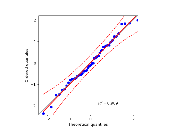
This function returns a scatter plot of the quantile of the sample data
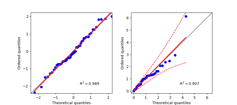
xagainst the theoretical quantiles of the distribution given indist(default = ‘norm’).The points plotted in a Q–Q plot are always non-decreasing when viewed from left to right. If the two distributions being compared are identical, the Q–Q plot follows the 45° line y = x. If the two distributions agree after linearly transforming the values in one of the distributions, then the Q–Q plot follows some line, but not necessarily the line y = x. If the general trend of the Q–Q plot is flatter than the line y = x, the distribution plotted on the horizontal axis is more dispersed than the distribution plotted on the vertical axis. Conversely, if the general trend of the Q–Q plot is steeper than the line y = x, the distribution plotted on the vertical axis is more dispersed than the distribution plotted on the horizontal axis. Q–Q plots are often arced, or “S” shaped, indicating that one of the distributions is more skewed than the other, or that one of the distributions has heavier tails than the other.
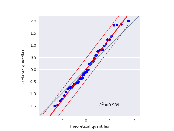
In addition, the function also plots a best-fit line (linear regression) for the data and annotates the plot with the coefficient of determination \(R^2\). Note that the intercept and slope of the linear regression between the quantiles gives a measure of the relative location and relative scale of the samples.
Warning
Be extra careful when using fancier distributions with several parameters. Always double-check your results with another software or package.
References
Fox, J. (2008), Applied Regression Analysis and Generalized Linear Models, 2nd Ed., Sage Publications, Inc.
Examples
Q-Q plot using a normal theoretical distribution:
>>> import numpy as np
>>> import pingouin as pg
>>> np.random.seed(123)
>>> x = np.random.normal(size=50)
>>> ax = pg.qqplot(x, dist="norm")

Two Q-Q plots using two separate axes:
>>> import numpy as np
>>> import pingouin as pg
>>> import matplotlib.pyplot as plt
>>> np.random.seed(123)
>>> x = np.random.normal(size=50)
>>> x_exp = np.random.exponential(size=50)
>>> fig, (ax1, ax2) = plt.subplots(1, 2, figsize=(9, 4))
>>> ax1 = pg.qqplot(x, dist="norm", ax=ax1, confidence=False)
>>> ax2 = pg.qqplot(x_exp, dist="expon", ax=ax2)

Using custom location / scale parameters as well as another Seaborn style
>>> import numpy as np
>>> import seaborn as sns
>>> import pingouin as pg
>>> import matplotlib.pyplot as plt
>>> np.random.seed(123)
>>> x = np.random.normal(size=50)
>>> mean, std = 0, 0.8
>>> sns.set_style("darkgrid")
>>> ax = pg.qqplot(x, dist="norm", sparams=(mean, std))
